Page: 1
/ 14
Total 363 questions
CompTIA Data+ Certification Exam DA0-001 Practice Questions
Question 1
Each month an analyst needs to execute a data pull for the two prior months. Which of the following is the most efficient function for the analyst to use?
Answer : B
The most efficient function for an analyst to execute a data pull for the two prior months would be the Date function. This function allows for the manipulation and formatting of date values within a database. Using Date functions, an analyst can dynamically calculate the start and end dates for the previous two months, ensuring that the data pull is accurate and automated without manual intervention.
For example, SQL functions likeDATEADDandDATEDIFFcan be used to determine the exact range of dates needed for the data pull. These functions can calculate the first and last day of the previous months relative to the current date, which is essential for monthly reporting and analysis.
Discussions on Stack Overflow suggest using SQL date functions likeDATEADDandDATEDIFFto dynamically extract data for previous months, which supports the use of Date functions12.
The use of Date functions is also recommended for ensuring that the data pull is not only efficient but also accurate, as it avoids potential errors associated with manual date entry3.
Question 2
An analyst is required to run a text analysis of data that is found in articles from a digital news outlet. Which of the following would be the BEST technique for the analyst to apply to acquire the data?
Answer : A
This is because web scraping is a technique that allows the analyst to extract data from web pages, such as articles from a digital news outlet. Web scraping can be done using various tools and methods, such as Python libraries, browser extensions, or online services. The other techniques are not suitable for acquiring data from web pages. Here is why:
Sampling is a technique that involves selecting a subset of data from a larger population, usually for statistical analysis or testing purposes. Sampling does not help the analyst to acquire data from web pages, but rather to reduce the amount of data to be analyzed.
Data wrangling is a technique that involves transforming and cleaning data to make it suitable for analysis or visualization. Data wrangling does not help the analyst to acquire data from web pages, but rather to improve the quality and usability of the data.
ETL stands for Extract, Transform, and Load, which is a process that involves moving data from one or more sources to a destination, such as a data warehouse or a database. ETL does not help the analyst to acquire data from web pages, but rather to store and organize the data.
Question 3
Which of the following is a characteristic of a relational database?
Answer : C
It is structured in nature. This is because a relational database is a type of database that organizes data into tables, which consist of rows and columns. A relational database is structured in nature, which means that the data has a predefined schema or format, and follows certain rules and constraints, such as primary keys, foreign keys, or referential integrity. A relational database can be used to store, query, and manipulate data using a structured query language (SQL). The other characteristics are not true for a relational database. Here is why:
It utilizes key-value pairs. This is not true for a relational database, because key-value pairs are a way of storing data that associates each value with a unique key, such as an identifier or a name. Key-value pairs are typically used in non-relational databases, such as NoSQL databases, which do not have tables, rows, or columns, but rather store data in various formats, such as documents, graphs, or columns.
It has undefined fields. This is not true for a relational database, because fields are another name for columns in a table, which define the attributes or properties of each row or record in the table. Fields have defined names, types, and lengths in a relational database, which specify the format and size of the data that can be stored in each field.
It uses minimal memory. This is not true for a relational database, because memory is the amount of space or storage that is used by a database to store and process data. Memory usage depends on various factors, such as the size, complexity, and number of tables and queries in a relational database. A relational database can use a lot of memory if it has many tables with many rows and columns, or if it performs complex or frequent queries on the data.
Question 4
A data analyst has a set of data that shows the number of gallons of oil produced each day. The company would like to know the standard deviation for the data set. The variance for the data is 36 gallons. Which of the following is the standard deviation for gallons produced?
Answer : B
The standard deviation is a measure of the amount of variation or dispersion in a set of values. It is calculated as the square root of the variance. Given that the variance for the data set is 36 gallons, the standard deviation can be found by taking the square root of 36, which is 6. Therefore, the standard deviation for the number of gallons of oil produced each day is 6 gallons.
The concept of standard deviation and its calculation is a fundamental aspect of statistics, which is well-documented in statistical textbooks and resources.
The calculation performed to arrive at the answer is based on the mathematical operation of taking the square root of the variance value.
Question 5
A data analyst has been asked to organize the table below in the following ways:
By sales from high to low -
By state in alphabetic order -
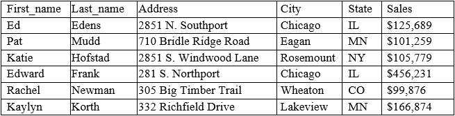
Which of the following functions will allow the data analyst to organize the table in this manner?
Answer : D
Sorting is the function that will allow the data analyst to organize the table in the desired manner. Sorting means arranging the data in a specific order, such as ascending or descending, based on one or more criteria. Sorting can be applied to any column in the table, such as sales or state. Reference: CompTIA Data+ Certification Exam Objectives, page 11
Question 6
A data analyst needs to create a data visualization that aids in un the cumulative impact of sequentially introduced values that are positive or negative. Which of the following
data visualization methods should the analyst use?
Answer : B
A waterfall chart is a type of data visualization that shows the cumulative impact of sequentially introduced values that are positive or negative. A waterfall chart typically has an initial value and a final value, with intermediate values shown as floating columns that either add to or subtract from the initial value. A waterfall chart can help visualize how different factors contribute to a net change in a value over time. Therefore, the correct answer is B. Reference: [Waterfall Chart | Definition & Examples - Investopedia], [Waterfall Charts in Excel | How to Create Waterfall Chart in Excel?]
4of30
Question 7
Which of the following variable name formats would be problematic if used in the majority of data software programs?
Answer : D
This is because First Name is a variable name format that would be problematic if used in most of the data software programs, such as Excel, SQL, or Python. This is because First Name contains a space between two words, which could cause confusion or errors in the data software programs, as they might interpret the space as a separator or a delimiter between two different variables or values, rather than as part of a single variable name. For example, in SQL, a space is used to separate keywords, clauses, or expressions in a statement, such as SELECT, FROM, WHERE, etc. Therefore, using First Name as a variable name in SQL could result in a syntax error or an unexpected result. The other variable name formats would not be problematic if used in most of the data software programs. Here is why:
First_Name_ is a variable name format that uses an underscore (_) to separate two words, which is a common and acceptable practice in most of the data software programs, as it helps to improve the readability and clarity of the variable name. For example, in Python, an underscore is used to follow the PEP 8 style guide for naming variables, which recommends using lowercase letters and underscores for multi-word variable names.
FirstName is a variable name format that uses camel case to separate two words, which is another common and acceptable practice in most of the data software programs, as it helps to reduce the length and complexity of the variable name. For example, in Excel, camel case is used to follow the VBA naming conventions for naming variables, which recommends using mixed case letters for multi-word variable names.
First_Name is a variable name format that also uses an underscore (_) to separate two words, which is also a common and acceptable practice in most of the data software programs, as it helps to improve the readability and clarity of the variable name. For example, in SQL, an underscore is used to follow the ANSI SQL naming standards for naming variables, which recommends using lowercase letters and underscores for multi-word variable names.