Page: 1
/ 14
Total 50 questions
Qlik Sense Business Analyst Certification Exam - 2024 QSBA2024 Exam Questions
Question 1
A business analyst needs to build a chart that enables users to analyze the correlation between the following measures for all products:
* Product Sales ($)
* Order Volume
* Margin%
Which visualization should the business analyst use?
Answer : C
A scatter plot is the most appropriate visualization for analyzing the correlation between Product Sales ($), Order Volume, and Margin %. Scatter plots are ideal for showing relationships between two or more continuous variables, which is crucial for identifying trends or correlations among these measures.
Key Concepts:
Scatter Plot: This chart type is specifically designed to display correlations between measures, making it the ideal choice for visualizing relationships between Product Sales, Order Volume, and Margin %.
Multiple Measures: Scatter plots in Qlik Sense can plot two measures on the X and Y axes and can use colors or bubbles to represent additional measures (such as Margin %).
Why the Other Options Are Less Suitable:
A . Multi KPI: A Multi KPI displays multiple metrics but doesn't show correlations between them.
B . Combo chart: A combo chart combines bar and line charts but is not suited for analyzing correlations between multiple continuous measures.
D . Pivot table: While useful for data aggregation, a pivot table does not provide a clear visualization of correlations between measures.
References for Qlik Sense Business Analyst:
Scatter Plot for Correlation Analysis: Scatter plots are recommended in Qlik Sense when exploring relationships between multiple continuous variables.
Thus, the scatter plot is the most effective visualization for analyzing the correlation between Product Sales, Order Volume, and Margin %, making C the correct answer.
Question 2
A clothing manufacturer has operations throughout Europe and needs to manage access to the data.
There is data for the following countries under the field SACOUNTRY -> France, Spain, United Kingdom and Germany. The application has been designed with Section Access to manage the data displayed.
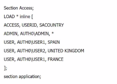
What is the expected outcome of this Section Access table?
Answer : A
In this Section Access script, the roles and access to data for different users are defined based on the SACOUNTRY field. Here's how the data access will work:
ADMIN: The ADMIN user has access to all data because the * in the SACOUNTRY field allows full access to all countries in the dataset.
USER1: This user has access to Spain and France because the SACOUNTRY field specifies these countries for USER1.
USER2: This user has access to United Kingdom because the SACOUNTRY field specifies only the UK for USER2.
Key Concepts:
Section Access: This feature in Qlik Sense controls which data users can see based on their login credentials. The access rights are controlled through fields like ACCESS, USERID, and SACOUNTRY in this case.
Why the Other Options Are Less Suitable:
B and C: These suggest that users won't see data they have access to, which contradicts the defined Section Access script.
D: This incorrectly assumes that ADMIN cannot see Germany, which is not defined in the script.
References for Qlik Sense Business Analyst:
Section Access Best Practices: In Qlik Sense, Section Access tables define the data that users can see, and the use of * for the ADMIN role ensures access to all data.
Thus, A is the correct answer because it matches the expected data access behavior based on the script, making it the verified answer.
Question 3
A company director who spends very little time in applications needs to be informed when a threshold is breached. Which feature should the business analyst use?
Answer : C
To inform a company director when a threshold is breached, Alerting is the most appropriate feature. Qlik Sense allows users to set up automated alerts based on specific conditions or thresholds. These alerts can be configured to notify users when certain criteria are met, making it ideal for keeping the director informed without requiring them to constantly check the application.
Key Concepts:
Alerting: This feature allows users to set conditions (such as when a sales or performance threshold is breached) and automatically send notifications to the relevant individuals.
Automated Notifications: Alerting ensures that the director is notified promptly and automatically when a critical threshold is reached.
Why the Other Options Are Less Suitable:
A . Weekly PDF report: A weekly report would not provide real-time notifications, which are necessary when thresholds are breached.
B . Storytelling: Storytelling is used for presentations, not for monitoring thresholds.
D . Bookmark: A bookmark only saves a particular selection or view, and cannot send notifications when a condition is met.
References for Qlik Sense Business Analyst:
Alerting in Qlik Sense: Qlik Sense's alerting functionality is designed to notify users when specific conditions are triggered, making it ideal for scenarios where timely notifications are critical.
Thus, using Alerting is the best solution to notify the director when a threshold is breached, making C the verified answer.
Question 4
A customer needs to demonstrate the value of sales for each month of the year with a rolling 3-month summary. Which visualization should the business analyst recommend to meet the customer's needs?
Answer : C
A combo chart is the most suitable visualization to show the value of sales for each month along with a rolling 3-month summary. The combo chart allows you to combine different types of visualizations, such as bars for monthly sales values and a line for the rolling 3-month summary. This provides a clear comparison and tracking of sales trends over time.
Key Concepts:
Rolling Summary: In this case, a 3-month rolling summary can be shown as a line measure in the combo chart, while the sales values for each month can be shown as bars.
Combo Chart: This visualization is ideal for comparing multiple measures on the same axis, such as individual sales values and aggregated rolling summaries.
Why the Other Options Are Less Suitable:
A . Scatter plot: A scatter plot is used to display the relationship between two variables, not to show time-based trends or rolling summaries.
B . Mekko chart: Mekko charts are used for categorical data and comparisons across categories, not for time-based analysis.
D . Pie chart: Pie charts are best suited for showing parts of a whole and are not appropriate for visualizing time-based data or rolling summaries.
References for Qlik Sense Business Analyst:
Combo Charts for Time Series Data: Combo charts are highly recommended when there is a need to compare different types of measures (like individual sales vs. rolling averages) over time in Qlik Sense.
Thus, a combo chart provides the most effective solution for showing both monthly sales values and the rolling 3-month summary, making C the correct answer.
Question 5
A company CEO requests an app that contains global sales information. The CEO needs to present this information to an audience of international investors during an upcoming meeting.
The presentation must meet several requirements:
* Contain visualizations that present clearly to a large audience
* Answer audience questions dynamically
* Be made available as shared content
* Emphasize important sales revenue
Which Qlik Sense features should the business analyst prepare?
Answer : D
To meet the CEO's requirements for a dynamic, interactive, and visually impactful presentation that can also be shared, the Storytelling feature in Qlik Sense is the best option. The Storytelling feature allows the business analyst to create a narrative combining static snapshots and live Qlik Sense sheets. This is perfect for large presentations as it lets the CEO present critical information and answer audience questions dynamically by embedding live sheets into the story, making the presentation interactive.
Key Concepts:
Storytelling: This feature allows the creation of a sequence of slides that include embedded live Qlik Sense visualizations, enabling dynamic responses to audience questions.
Shared Content: Once the app is published, it can be shared with a broader audience, allowing stakeholders to interact with the embedded sheets.
Why the Other Options Are Less Suitable:
A . Embed a video player: While videos can be useful, they do not allow for dynamic interaction, which is a requirement.
B . Colorful and layered visualizations exported as PDF: PDFs are static, and exporting as a PDF would not allow for dynamic interaction during the presentation.
C . NPrinting slideshow-style report: NPrinting is useful for generating reports, but it does not meet the need for live, dynamic presentations.
References for Qlik Sense Business Analyst:
Qlik Sense Storytelling for Presentations: Storytelling allows users to blend narrative and interactive elements, making it ideal for presenting to large audiences.
Thus, D is the best choice because it meets all the requirements for interactive and dynamic presentations, making it the verified answer.
Question 6
A business analyst is creating an app for the sales team. The app must meet several requirements:
* Compare 10 top-performing sales representatives and the amount of sales for each
* Investigate margin percentage and total sales by each product category
* View distribution of sales amount
Which visualizations should be used for this app?
Answer : A
For this scenario, using a bar chart, scatter plot, and histogram provides the best coverage of the requirements. The bar chart is ideal for comparing the sales performance of the top 10 sales representatives. The scatter plot is used to analyze the relationship between margin percentage and total sales by product category. The histogram is excellent for visualizing the distribution of sales amounts.
Key Concepts:
Bar Chart: Perfect for comparing categorical data, such as sales amounts across different sales representatives.
Scatter Plot: Ideal for exploring relationships between two variables, such as margin percentage and total sales.
Histogram: Provides a clear visualization of the distribution of a continuous variable, such as sales amounts.
Why the Other Options Are Less Suitable:
B . Treemap, Container, and Distribution plot: A treemap is less effective for comparing individual sales reps, and a container does not provide a clear visualization on its own.
C . Bar chart, Line chart, and Scatter plot: A line chart is not needed in this case, as it is best for showing trends over time, which is not required here.
D . Treemap, Box plot, and Histogram: A box plot is more suited for showing statistical distributions (e.g., quartiles), which is unnecessary in this case.
References for Qlik Sense Business Analyst:
Data Exploration: Bar charts, scatter plots, and histograms are among the most commonly recommended visualizations for comparing performance, analyzing relationships, and viewing distributions in Qlik Sense.
Thus, the combination of a bar chart, scatter plot, and histogram offers the most comprehensive solution, making A the correct answer.
Question 7
A marketing team needs to display sales for a limited number of products by providing a bar chart that the user can control. The visualization has several requirements:
* Starts with the top five products
* Allows the user to change the number of products displayed
* Allows the user to scroll through all products on a mini chart
The business analyst creates a bar chat and a variable. Which steps should the business analyst complete next?
Answer : A
To meet the requirement of controlling the number of products displayed in the bar chart, the business analyst should use a slider object tied to a variable. The variable will store the number of products the user wants to display. In the Appearance section of the bar chart's properties, the analyst can set the number of bars to a custom value using the variable, ensuring that the user can dynamically change the number of displayed products.
Key Concepts:
Slider Object: This provides a user-friendly way for users to adjust the number of products displayed in the bar chart.
Custom Bar Limitation: By setting the number of bars displayed to a custom value controlled by the variable, the business analyst ensures that the user can dynamically adjust how many products are shown.
Why the Other Options Are Less Suitable:
B . Use the variable to fix the limitation and add an input box: While this could work, sliders provide a better, more intuitive user experience than input boxes for adjusting values dynamically.
C . Use the variable to fix the limitation and add a slider: This is almost correct, but it misses the step of setting the number of bars to a custom value using the variable.
D . Add the slider object and set its value, but without custom bar settings: While adding a slider is correct, not setting the number of bars to custom using the variable means the user wouldn't be able to dynamically control the number of displayed products.
References for Qlik Sense Business Analyst:
Dynamic Control with Variables and Sliders: Qlik Sense best practices recommend using sliders and variables to give users control over visualizations, particularly when it comes to dynamically limiting data displayed.
Thus, adding the slider object and setting the number of bars to a custom value controlled by the variable is the best solution, making A the verified answer.