Salesforce Certified Tableau Consultant Analytics-Con-301 Exam Questions
A consultant used Tableau Data Catalog to determine which workbooks will be affected by a field change.
Catalog shows:
Published Data Source 7 connected workbooks
Field search (Lineage tab) 6 impacted workbooks
The client asks: Why 7 connected, but only 6 impacted?
Answer : C
Comprehensive and Detailed Explanation From Exact Extract:
Key Tableau Catalog behaviors:
Connected workbooks = any workbook linked to the published data source.
Impacted workbooks = only workbooks that use the specific field.
If a workbook connects to the data source but never uses the field, it appears as ''connected'' but not impacted.
This explains EXACTLY why:
7 workbooks are connected
Only 6 use the changed field
Therefore only 6 are impacted
This matches Option C.
Why the other options are incorrect:
A . Field used twice
Still counts as one workbook --- does not explain discrepancy.
B . Permission issue
If permissions blocked visibility, the data source would not list 7 connections.
D . Custom SQL use
Catalog can still detect field usage through metadata lineage; Custom SQL does NOT hide workbook dependency.
Thus, only Option C logically explains the scenario.
Data Catalog lineage rules: ''Connected vs. Impacted'' distinction.
Field-level impact analysis documentation.
Workbook dependency logic within Tableau Catalog.
A client is migrating their data warehouse. They visualize the data in workbooks hosted on Tableau Server with Tableau Data Management enabled and want to see how many workbooks will be impacted.
What should the consultant do to quickly identify how many workbooks will be impacted?
Answer : A
Comprehensive and Detailed Explanation From Exact Extract:
When Tableau Data Management is enabled, Tableau Catalog provides Lineage capabilities that map connections between:
External databases
Tables
Data sources
Workbooks
Fields
Tableau documentation states that the Lineage tab for any external asset (such as a database or table):
Shows all connected workbooks
Shows dependencies and impact analysis
Allows admins to instantly assess how many analytics assets will be affected by a data warehouse migration
Option A directly uses Tableau Catalog to perform exactly this task.
Option B is unnecessary because the Catalog lineage tool already provides this information without development effort.
Option C is completely inappropriate because it offers no analysis or planning.
Option D is too time-consuming and unnecessary, especially when Tableau Catalog provides an automated dependency map.
Therefore, the correct method is to use the Lineage tab in External Assets.
Tableau Catalog lineage documentation showing how to view impacted workbooks.
External Assets and data source dependency features in Tableau Data Management.
Impact analysis best practices for data warehouse migration using Tableau Catalog.
A consultant is creating a dashboard to report on hourly sales data. The data should be refreshed hourly and is used for timely decision-making, so it is important to alert dashboard viewers when data has not been refreshed.
Which feature of Tableau Catalog should the consultant use to ensure dashboard viewers understand this message?
Answer : B
Comprehensive and Detailed Explanation From Exact Extract:
Tableau Catalog provides multiple features for communicating data quality and freshness.
Data Quality Warnings (DQWs) are part of Catalog's metadata management system and are specifically designed to inform users about data issues, including when data is stale.
There are two visibility levels:
1. Standard Visibility Data Quality Warning
Appears subtly in metadata panels.
Intended for non-critical issues.
Does not guarantee the message will be seen by dashboard viewers.
2. High Visibility Data Quality Warning
Designed for urgent, critical, and highly visible alerts.
Displays a prominent warning indicator directly on connected dashboards, data sources, and workbooks.
Tableau documentation states high-visibility warnings are used when users must be alerted, such as:
Stale data
Incomplete refreshes
Data outages
Because the question emphasizes:
''important to alert dashboard viewers when data has not been refreshed''
A standard warning is not strong enough, but a High Visibility Data Quality Warning is explicitly designed for this scenario.
Evaluation of the choices:
A . Standard Visibility Data Quality Warning --- Not sufficient
It does not force dashboard users to notice the warning.
B . High Visibility Data Quality Warning --- Correct
This option is specifically meant to notify users of critical freshness issues, making it the perfect match for the requirement.
C . Certified Data Source --- Incorrect
Certification communicates trustworthiness, not freshness or alerts.
D . Lineage --- Incorrect
Lineage shows data relationships and dependencies, not refresh warnings.
Conclusion
To alert viewers about stale data in hourly-refreshed dashboards, the consultant must use a High Visibility Data Quality Warning.
Reference From Tableau Catalog Documentation
Description of Data Quality Warnings and their visibility levels.
Definition of High Visibility DQWs as critical alerts shown to dashboard viewers.
Catalog guidelines for stale data detection and communication.
During a Tableau Cloud implementation, a Tableau consultant has been tasked with implementing row-level security (RLS). They have already invested in implementing RLS within their own database for their legacy reporting solution. The client wants to know if they will be able to leverage their existing RLS after the Tableau Cloud implementation.
Which two requirements should the Tableau consultant share with the client? Choose two.
Answer : A, C
Comprehensive and Detailed Explanation From Exact Extract:
In Tableau Cloud, database-level RLS can be used only with live connections because:
Tableau Cloud issues SQL queries using the logged-in user's identity.
Extracts break RLS because data is pulled out of the database and stored in Tableau's hyper file.
To leverage existing RLS rules, Tableau must query the database directly for the user.
Therefore:
Requirement 1:
The Tableau Cloud username (email) must exist in the database
so that the database can enforce RLS using the authenticated identity.
Requirement 2:
Only live data connections support database-native RLS.
Extracts bypass database security and therefore cannot use RLS defined in the database.
Option D is incorrect because RLS is enforced in the database, not configured in Tableau Cloud.
Option B is incorrect because extracts cannot use database RLS.
Thus, correct answers are A and C.
Tableau Cloud live connection security requirements.
Database RLS documentation requiring matching database user identities.
Explanation that extracts bypass database permission systems.
A Tableau consultant is tasked with choosing a method of setting up row-level security (RLS) entitlements with tables during a Tableau implementation. The consultant has received a set of roles from a client in one normalized table, and a set of entitlements from the client in another normalized table.
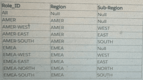
The consultant plans on using the deepest granularity method. However, when the consultant gains access to the final set of data, they discover duplicate values at the lowest level. Most of the regions in the client's dataset contain sub-regions named 'East' and 'West'. However, some regions have a 'Null' value for sub-region.

How should the consultant proceed?
Answer : C
Comprehensive and Detailed Explanation From Exact Extract:
Tableau's RLS entitlement design patterns include:
1. Deepest Granularity Method
Requires one unique role one unique lowest-level value pairing.
Fails when the dataset contains duplicate lowest-level values (e.g., multiple ''East'' sub-regions across different regions).
Cannot operate correctly when some lowest-level values are NULL.
Thus, the deepest granularity method is not valid here.
2. Sparse Entitlements Method
Tableau documentation states:
Sparse entitlements define RLS at each level of the hierarchy instead of only at the lowest level.
This method supports duplicate lowest-level values.
Handles scenarios where some levels are NULL because higher-level entitlements (e.g. Region = AMER) can still correctly apply.
More flexible for hierarchical geographic structures (Region Sub-Region Country, etc.).
Given the client's dataset:
Multiple ''East'' and ''West'' sub-regions
Some ''Null'' sub-regions
Hierarchical levels present
Sparse entitlements is the only correct and supported choice.
Why the incorrect options are wrong:
A & B --- Deepest Granularity
Deepest granularity fails when the lowest-level values are not unique.
It cannot handle NULL values at the lowest tier.
Performance is not superior in this scenario.
D --- Sparse because it is most performant
Performance is not the defining advantage.
Flexibility and ability to handle duplicate lowest-level values is.
Thus, C is the correct statement.
RLS entitlement design patterns: deepest vs. sparse entitlements.
Rules requiring unique lowest-level identifiers for deepest granularity.
Guidance stating sparse entitlements should be used when duplicates or NULL values exist in hierarchical structures.
A business analyst needs to create a view in Tableau Desktop that reports data from both Excel and MSSQL Server.
Which two features should the business analyst use to create the view? Choose two.
Answer : A, B
Comprehensive and Detailed Explanation From Exact Extract:
To combine Excel and SQL Server data in the same logical data model, Tableau offers two supported capabilities:
Relationships
Recommended modern method for combining tables from multiple sources.
Supports cross-database relationships between Excel and SQL Server.
Maintains separate physical layers but integrates data at query time.
Cross-Database Joins
Allows joining data from different databases in the physical layer.
Fully supported for Excel + MS SQL Server.
Useful when granular row-level merging is needed.
Why the other options are incorrect:
C . Data Blending
Legacy feature, used only when no direct combination is possible.
Tableau recommends relationships instead.
Produces separate queries and may lose row-level detail.
D . Union
Requires tables to have equivalent structure.
Cannot union Excel with SQL Server unless identical column structure exists.
Not appropriate for most mixed-source reporting.
Therefore, the correct techniques are Relationships and Cross-Database Joins.
Tableau data modeling documentation recommending Relationships for multi-source modeling.
Cross-database join support list including Excel + SQL Server.
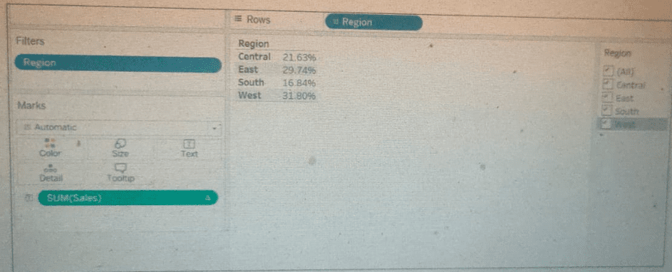
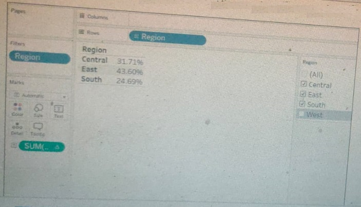
A client calculates the percent of total sales for a particular region compared to all regions.

The Sales percentage is inadvertently recalculated each time the filter is applied to the Region.

Which calculation should fix the automatic recalculation on the % of total field?
Answer : C
The problem:
The client wants:
Percent of total sales for each region compared to ALL regions,
even when Region is filtered.
However, the calculation currently behaves like a table calculation:
SUM([Sales]) / TOTAL(SUM([Sales]))
This recalculates the total after Region filters are applied, so removing a region changes the denominator.
Tableau Documentation --- How to prevent recalculation:
To keep percent-of-total unchanged when filtering, Tableau's recommended method is to use FIXED LOD expressions to lock the granularity.
Two values must be fixed:
Numerator: Sales for that specific region{ FIXED [Region] : SUM([Sales]) }
Denominator: Total sales across all regions, independent of filters{ FIXED : SUM([Sales]) }(FIXED with no dimension = entire data set)
Then compute the percentage:
{ FIXED [Region] : SUM([Sales]) } / { FIXED : SUM([Sales]) }
This ensures:
The region sales remain accurate.
The overall total remains constant, even if filters remove regions.
Region filtering no longer recalculates percent-of-total.
Why the other options are incorrect:
A . {FIXED [Region]: SUM([Sales])} / SUM([Sales])
The denominator is still affected by filters recalculates % of total.
B . {FIXED [Region]: SUM([Sales])} / { [Sales] }
{[Sales]} is not valid syntax and does not fix granularity.
D . {FIXED [Region]: SUM([Sales])}
This gives only the numerator --- no percent-of-total calculation.
The only correct LOD solution is option C.
Tableau LOD Expression Guide: FIXED for filter-independent calculations.
Tableau Percent-of-Total Best Practices: use FIXED LOD to avoid recalculation when filters change.
Order of Operations: FIXED LODs occur before dimension filters, keeping totals stable.