Page: 1
/ 14
Total 317 questions
Tableau Desktop Specialist TDS-C01 Exam Questions
Question 1
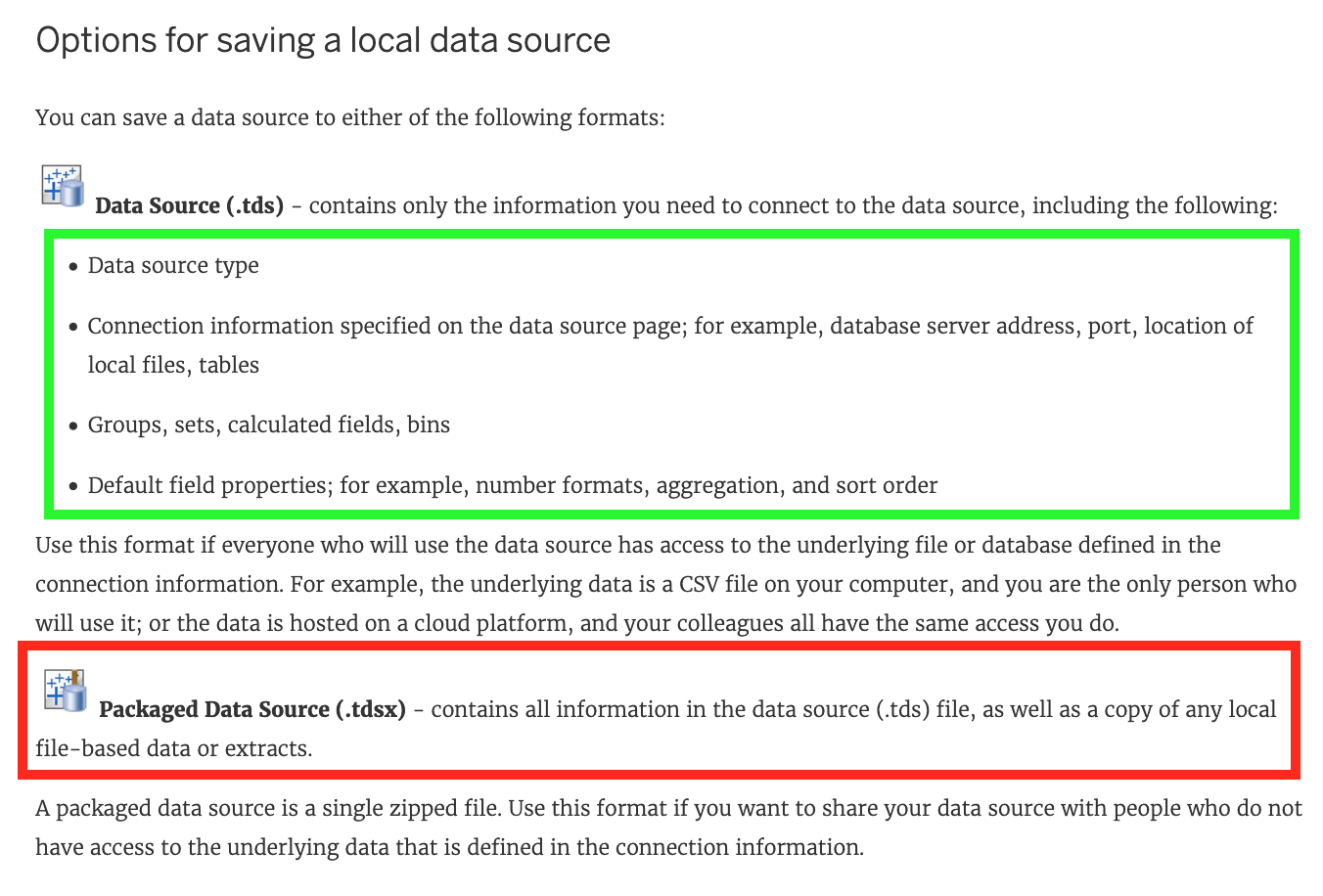
A Tableau Data Source File (.tds) contains which of the following?
Answer : A, C, D
All are correct, except - Copy of any local file-based data. This is contained in a .tdsx file (Tableau Packaged Data Source)!
According to the official documentation -
Question 2
Which of the following are valid ways to make the font more readable in Tableau?
Answer : C, D, E
This is one of the most common questions on the Tableau Desktop Specialist Exam.
Wrong options -
1) Don't use backgrounds -This is not a solution. What if we want to use backgrounds? We can't just stop using backgrounds to solve this problem.
2) Decrease the font size -Do you think using a smaller font will make the text more readable? No right? Hence, this is wrong too.
All other options are ways recommended to make your text more readable!
Question 3
Larger image
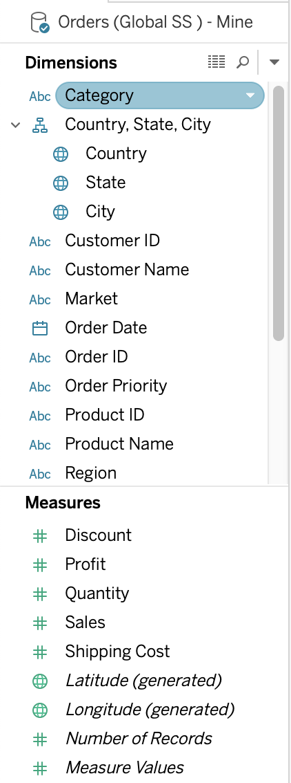
What is this view referred to as in Tableau?
Answer : C
Tableau displays data source connections and data fields for the workbook in the Data pane on the left side of the workspace.
The Data pane includes:
Dimension fields -- Fields that contain qualitative values (such as names, dates, or geographical data). You can use dimensions to categorize, segment, and reveal the details in your data. Dimensions affect the level of detail in the view. Examples of dimensions include dates, customer names, and customer segments.
Measure fields -- Fields that contain numeric, quantitative values can be measured. You can apply calculations to them and aggregate them. When you drag a measure into the view, Tableau applies an aggregation to that measure (by default). Examples of measures: sales, profit, number of employees, temperature, frequency.
For more information on what dimensions and measures are, see Dimensions and Measures, Blue and Green.
Calculated fields -- If your underlying data doesn't include all of the fields you need to answer your questions, you can create new fields in Tableau using calculations and then save them as part of your data source. These fields are called calculated fields.
For more information on calculated fields, see Create Custom Fields with Calculations.
Sets -- Subsets of data that you define. Sets are custom fields based on existing dimensions and criteria that you specify. For more information, see Create Sets.
Named sets from an MS Analysis Services server or from a Teradata OLAP connector also appear in Tableau in this area of the Data pane. You can interact with these named sets in the same way you interact with other custom sets in Tableau.
Parameters -- Values that can be used as placeholders in formulas, or replace constant values in calculated fields and filters. For more information, see Create Parameters.
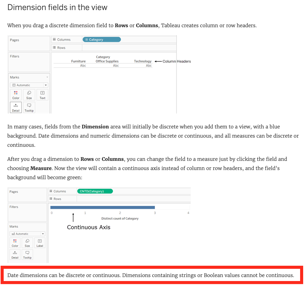
Question 4
Dimensions containing ____________ and ____________ values cannot be continuous.
Answer : A, D
According to Tableau's official documentation -
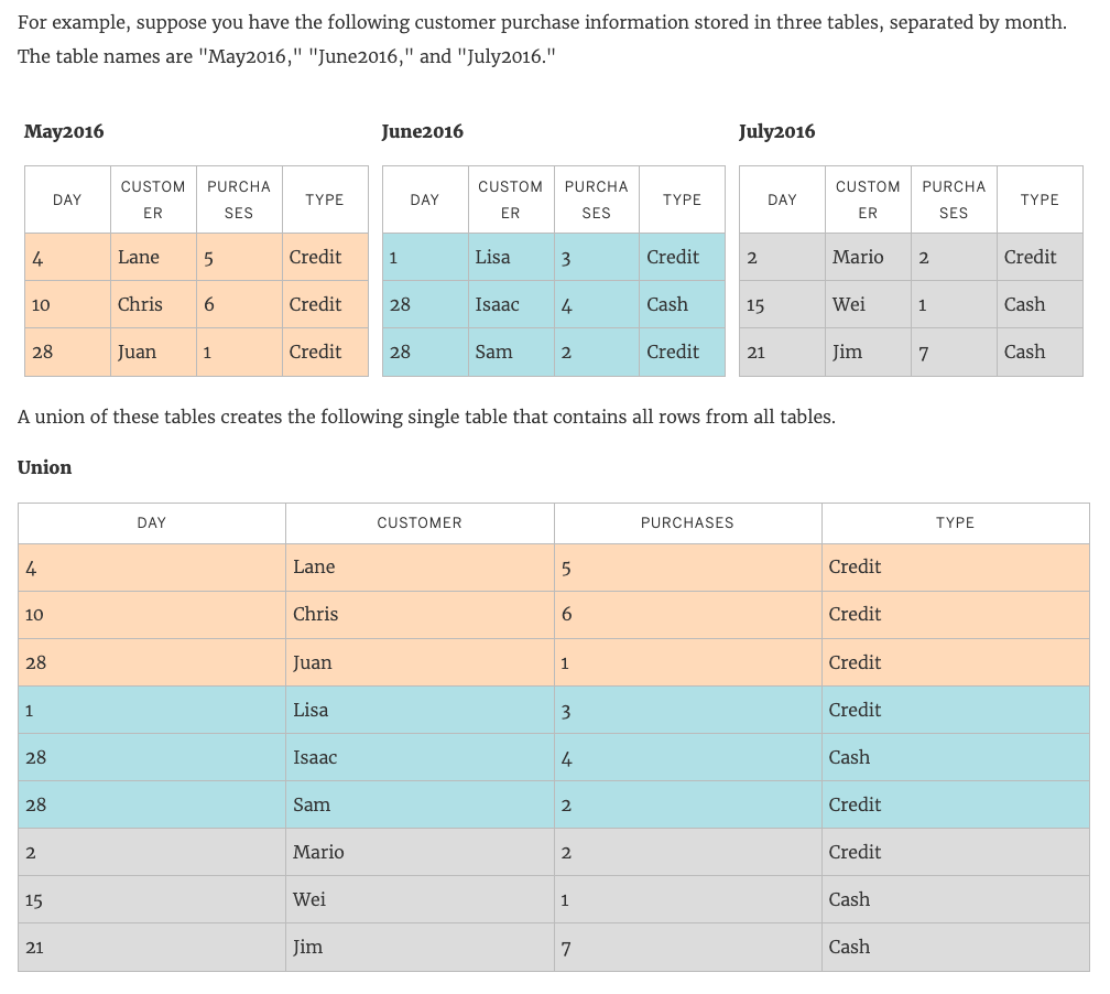
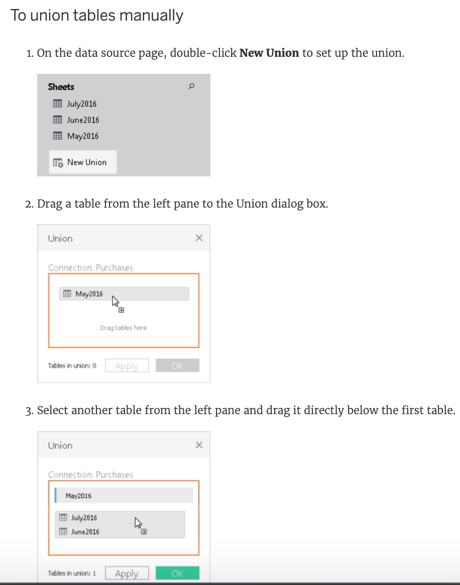
Question 5
A union of two tables usually results in an
Answer : B
From the official Tableau documentation:
You can union your data to combine two or more tables byappending values (ROWS)from one table to another. To union your data in Tableau data source, the tables must come from thesameconnection.
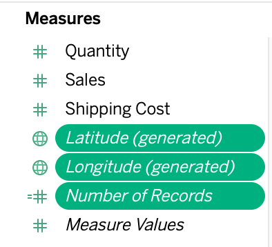
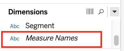
Question 6
Which one of the following is a dimension?
Answer : B
Measure Names is a dimension. Latitude, Longitude, and Number of records are all measures.
Question 7
Which two options can you use to change the device layout of a dashboard? Choose two.
Answer : A, D
You can change the device layout of a dashboard by using the Dashboard pane or the Dashboard menu. The Dashboard pane allows you to select a device type and customize the layout for that device. The Dashboard menu allows you to create a new device layout or copy an existing one.The Format menu and the Layout pane do not have options for changing the device layout1