Page: 1
/ 14
Total 94 questions
WGU Applied Algebra (C957) Exam Questions
Question 1
The number of property sales in a region this year is expected to be 6 less than the number of property sales in the region last year. The function represents the number of property sales this year, where represents the number of properties sold last year.
Which notation represents the number of property sales this year, given that the number of properties sold last year was 330?
Answer : A
We are told that this year's number of property sales is 6 less than last year's number of property sales.
Let:
and
Since this year's sales are 6 less than last year's sales, the function rule is:
The question says that the number of properties sold last year was:
Substitute into the function:
So the notation that correctly represents the number of property sales this year is:
This means: if 330 properties were sold last year, then 324 properties are expected to be sold this year.
Question 2
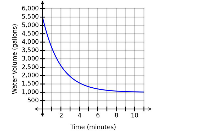
After a water tank starts leaking, the amount of water in the tank is modeled by the exponential function that is graphed.
Which statement is justified considering the location of the horizontal asymptote?
Answer : A
The graph shows the water volume decreasing over time.
The vertical axis represents:
The horizontal axis represents:
The graph is an exponential decay curve. It decreases quickly at first, then levels off.
From the graph, the curve approaches a horizontal value near:
This means the horizontal asymptote is approximately:
Since the graph approaches 1,000 gallons, it will not decrease to 500 gallons according to this model.
The water volume does not change by a constant rate because exponential functions do not have constant additive change. Also, the graph decreases fastest at the beginning, not later.
Question 3
The number of employees under supervisor B is 13 more than the number of employees under supervisor A. Let represent the number of employees under the two supervisors, where is the number of employees under supervisor A and is the number of employees under supervisor B.
Which is the correct function to represent this relationship?
Answer : C
We are told that supervisor B has 13 more employees than supervisor A.
Let:
and
The phrase ''13 more than'' means we add 13:
So, if supervisor A has employees, supervisor B has 13 additional employees.
For example, if supervisor A had 20 employees, then supervisor B would have:
Therefore, the correct answer is:
Question 4
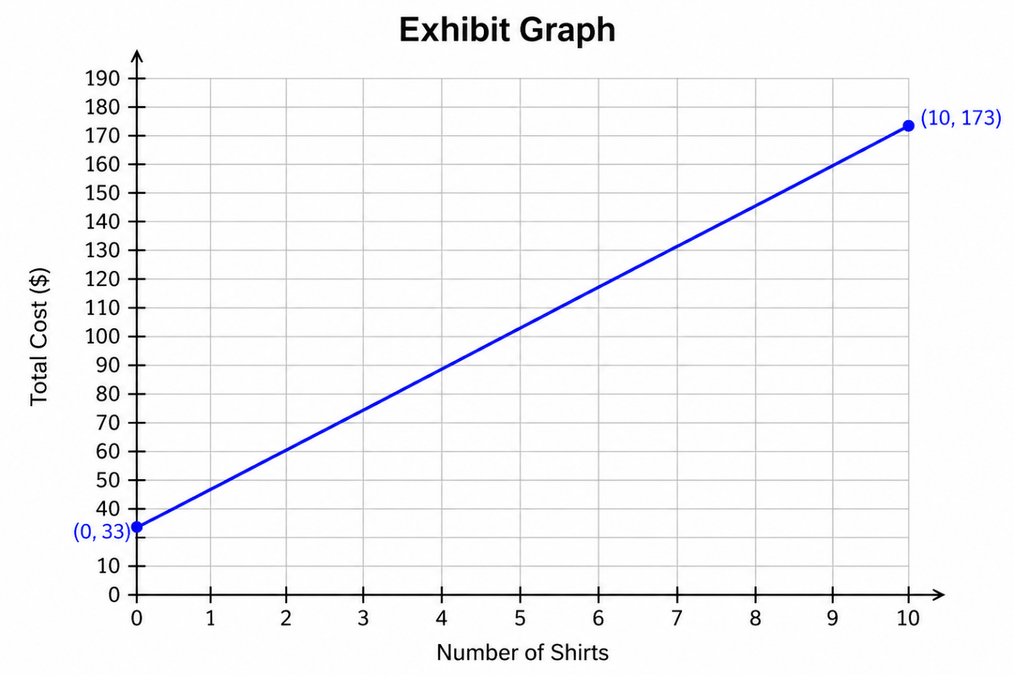
A coach is placing an order for team shirts. The graph shows the total cost based on the number of shirts.
What is the cost of each additional shirt?
Answer : B
This question asks for the cost of each additional shirt, which means we need to find the rate of change of the linear function.
On a graph, the rate of change is the slope:
From the graph, two labeled points are:
and
This means:
When shirts are ordered, the cost is .
When shirts are ordered, the cost is .
Now find the slope:
So the cost increases by:
for each additional shirt.
The represents a fixed starting cost, not the cost per shirt.
Question 5
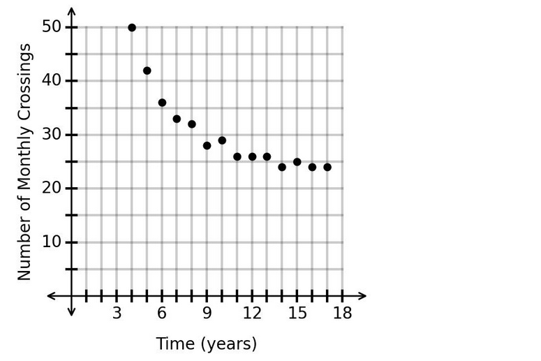
The data in the scatterplot represents the number of monthly train crossings at a particular intersection over time.
Which type of function should be used to model the data?
Answer : D
The scatterplot shows a decreasing pattern.
At first, the number of monthly crossings decreases quickly. Then the values begin to level off.
This type of pattern is characteristic of an exponential decay model.
A linear model would show points decreasing at a constant rate, forming an approximately straight line. Here, the decrease is not constant; it is steep at first and then slows down.
A logistic model usually has an S-shaped pattern, which is not shown here.
A polynomial model may curve, but the long-term leveling behavior shown in the scatterplot is best represented by an exponential decay function.
Therefore, the correct answer is:
Question 6
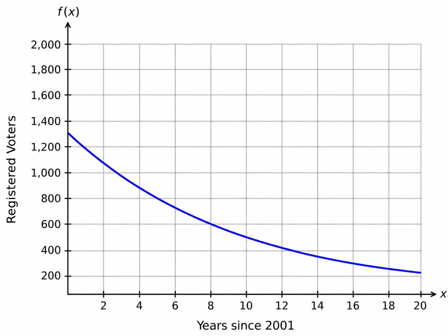
Based on collected data, the number of registered voters in a district can be modeled using the function
whose graph is shown, where represents the number of years since 2001 and represents the number of registered voters.
Which time period has the fastest average decrease in the number of registered voters?
Answer : A
The function is:
This is an exponential decay function because the base is between 0 and 1:
So the number of registered voters is decreasing over time.
Since represents the number of years since 2001:
To determine the fastest average decrease, compare the average rates of change. A faster decrease means the average rate of change is more negative.
For 2001 to 2007:
So from 2001 to 2007, the number of registered voters decreased by about:
For 2007 to 2008:
For 2008 to 2021:
For 2009 to 2012:
Now compare the decreases:
The most negative rate is:
That means the fastest average decrease happened from:
Question 7
The number of property sales in a region this year is expected to be 8 times the number of property sales in the region last year. The function represents the number of property sales this year, where represents the number of properties sold last year.
Which notation represents the number of property sales this year, given that the number of properties sold last year was 360?
Answer : C
We are told that the number of property sales this year is expected to be 8 times the number of property sales last year.
Let:
and
Since this year's sales are 8 times last year's sales, the function rule is:
The question says that last year's property sales were:
Substitute into the function:
So the correct notation is:
This means: if 360 properties were sold last year, then 2,880 property sales are expected this year.
Therefore, the correct answer is:
 All Official Question Types